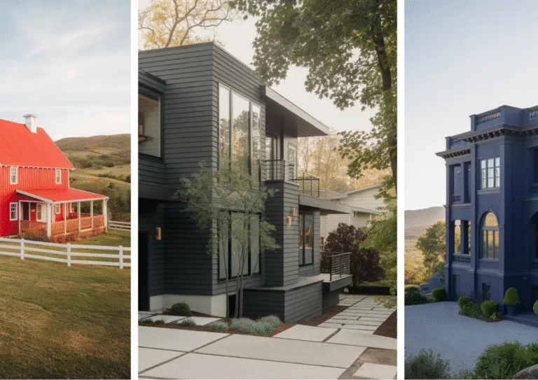
18 Seriously Beautiful Dark Exterior House Colors You Need to Check Out
Thinking of painting your house dark but feeling unsure if it’s the right move? Good. You should be.
Because dark exteriors aren’t just paint colors—they’re bold statements.
They say, “This house has style,” and honestly, they’re the easiest way to go from “just another house on the block” to the house everyone stares at.
Whether you’re drawn to moody charcoals, inky blacks, or deep greens, the right dark hue will amplify your home’s personality, create insane contrast, and instantly add elegance.
So, if you’re ready to break away from boring beige and wish-washy neutrals, this list of 18 dark exterior paint colors will help you find your perfect match.
Let’s dive into these head-turning shades that’ll leave your neighbors wondering when they can copy you. Ready?
Regenerate with
Why Are Dark Exterior Colors So Popular?
Let’s be real—dark house colors weren’t exactly on everyone’s radar 10 years ago. Most people played it safe with neutral palettes. But now? Dark exteriors scream modern sophistication. Here’s why they’re so hot right now:
– They Make a Statement
Dark houses stand out. Whether it’s a deep black, moody navy, or a sharp charcoal, these colors demand attention. (Not the “look at me, I’m tacky” kind of attention—more like the “damn, that house looks expensive” kind).
– They’re Surprisingly Versatile
Don’t think dark exteriors are a one-size-fits-all situation. They work on ultra-modern homes, cozy cabins, and even stately Victorians. Seriously, slap a deep green on a Tudor-style house, and it’ll look like it belongs in a fairytale forest.
– Adds Contrast to Your Surroundings
Whether your house is surrounded by lush greenery or sits on a minimalist landscape, dark colors create instant contrast. That pop of dark against the lighter background? Chef’s kiss. You can’t go wrong.
– Trend-Forward but Timeless
Dark colors might feel trendy, but they don’t go out of style. Black has been cool forever (hello, little black dress). If done right, a dark house will feel classic for decades.
So, why fight it? Dark homes are basically the “hot goth kid” of the real estate world.
Does a Dark Exterior Work for Every House?
Okay, this is a valid question. The truth is, dark colors don’t work everywhere. But don’t worry—most homes can pull it off with the right tweaks. Let’s break it down:
– Houses That Shine with Dark Colors:
- Modern Homes: Clean lines + dark colors? It’s a match made in architectural heaven.
- Cottages and Cabins: A dark green or brown cottage in the woods? Pure vibes.
- Victorian Homes: Old-school charm meets modern drama when you go dark.
– Houses That Might Struggle:
- Tiny Homes: Dark colors can make small homes look even smaller. Pro tip: Add lighter trim to brighten it up.
- Homes with Minimal Natural Light: Dark exteriors can feel too heavy if your location is already gloomy 365 days a year.

1. Tonal Shades of Blue
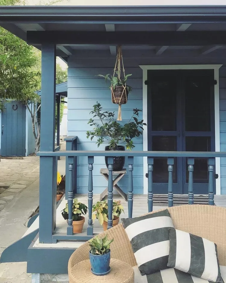 Source: K Shan Design
I’ve always loved how layered blue tones can make a house feel calm and inviting. On this home, the siding, railings, and accents create a cohesive look without being overwhelming.
To enhance a similar style, mix lighter and darker blues for depth. Keep the porch details subtle but intentional, like a striped cushion or a hanging planter.
Balance the overall look with greenery or wooden elements that soften the design. Blue never has to feel cold—it can be so welcoming!
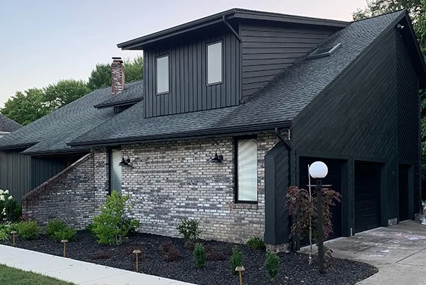
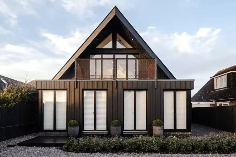
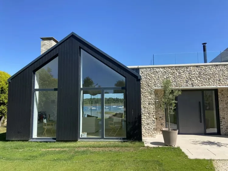
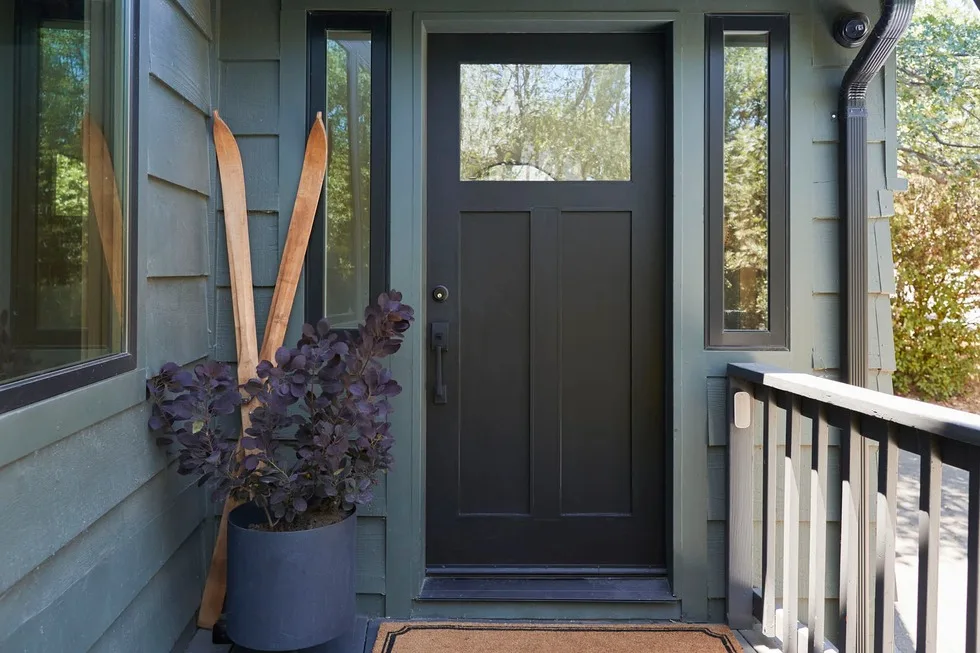
2. Matte Black
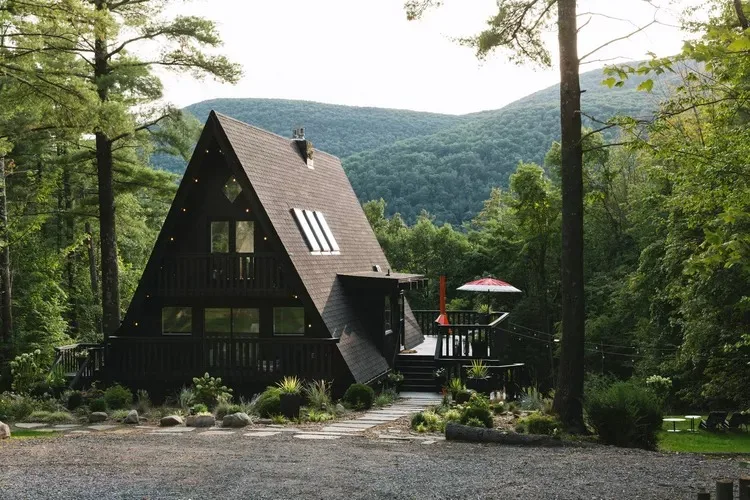 Source: Nick Glimenakis
Matte black homes are the definition of bold and sophisticated. This A-frame cabin blends into the environment while still feeling edgy and modern.
A great way to approach this look is by adding subtle lighting accents around windows or pathways for warmth. Minimalist landscaping works wonders to keep it balanced.
If the all-black look feels too bold for you, natural wood furniture or bright pops of color can offer warmth and softness.
3. Charcoal + Stone
 Source: Brepurposed
Charcoal siding paired with stone is timeless yet contemporary. It’s a rich, grounded look that feels both rustic and refined.
To pull off this vibe, focus on textures—smooth siding complements the roughness of natural stone beautifully. Layering earthy tones like charcoal and black enhances depth.
For landscaping, go with neat shrubs or evergreen plants that don’t compete with the materials but add to the natural aesthetic.
4. Blue Gray + Beige
 Source: Steven Gray
I adore the combination of blue-gray and beige—it’s simple, stylish, and endlessly versatile. Mixing these tones creates a fresh, modern feel without trying too hard.
One way to make this pairing pop is by adding a bold accent door. A red or mustard yellow door would add personality without clashing.
For a finishing touch, choose understated landscaping—white flowers or light greenery pair perfectly with this palette.
5. Olive Green, White, and Red
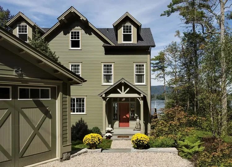 Source: Rob Karosis
Olive green is such an understated color that works beautifully with crisp white and warm red accents. It creates a cozy, earthy vibe.
Try this color combination if your home is surrounded by trees, as it blends beautifully with nature. The red pops without being overwhelming.
Small details like terracotta planters or warm wood furniture on the porch complete the look while enhancing the home’s lived-in charm.
6. All Blue-Gray
 Source: Emily Gilbert Photography
The monochrome look of blue-gray gives a home an effortlessly chic and modern style. It’s great if you prefer understated elegance.
To make this work, play with textures. Try vertical paneling for the siding or a combination of smooth trims for added interest.
Pair it with bright green plants or a bold-colored bench to break up the uniform color scheme. It’s simple, but it still leaves room for creativity.
7. Deep Sea + White + Red
 Source: HGTV Magazine.
Deep sea blue is rich and timeless, and pairing it with white and red creates a playful yet balanced look. It gives off that effortless coastal vibe.
The pops of red, like on a roof or front door, bring so much charm. I once helped a friend do this, and it completely transformed their home!
Keep surrounding details minimal—gravel paths, soft white lighting, or even a simple wooden accent elevate this fabulous color combo.
8. Falu Red and White
 Source: Fantastic Frank
Falu red and white are such a classic combination—it always makes me think of cozy barns or charming cottages. The red feels bold but nostalgic.
When adding white trims, make them clean and crisp to let the color contrast shine. It’s a combo that looks perfect in rural or countryside settings.
A simple addition like a pair of rocking chairs or lanterns by the door can make a big difference, adding warmth to the bold exterior.
9. Black on Black
 Source: Grant Ritchie
Black on black can feel intimidating, but when done right, it’s a showstopper. It’s sleek, modern, and makes an architectural statement.
Choose matte or satin finishes for the paint to avoid overly shiny surfaces. Completing the look with minimalist landscaping adds sharp focus.
Break it up with wood details, a glass front door, or a light gravel driveway. It’s all about keeping it clean and contemporary.
10. Slate Gray + White + Navy
 Source: Behr
Slate gray walls paired with crisp white trim give this home a clean, refreshing look. The texture of the siding adds subtle depth, while white accents on the windows and doors brighten the design.
The navy blue front door is the centerpiece, offering a classic and inviting contrast. It’s perfect for making a bold but balanced statement.
To tie it all together, add some lush greenery around the entrance—it enhances the color palette beautifully.
11. Slate Gray
 Source: CHRIS LOVES JULIA
Slate gray makes a bold statement while feeling effortlessly modern. Here, the smooth finish highlights the home’s clean lines and sharp angles.
Pairing it with darker roof accents and large windows brings out its sleek and elegant vibe. It’s a great choice for a minimalist, contemporary look.
If you want to soften it up, use warm outdoor lighting or natural stone elements—it adds warmth without changing the overall mood.
12. Red + White + Green
 Source: HGTV Magazine.
This red exterior is bright without being overwhelming, thanks to its clean white trim that keeps it fresh and balanced. It feels bold but inviting.
The subtle green accents (in shutters or landscaping) tie in perfectly with the surroundings, giving the home a cohesive character.
For extra charm, add a well-maintained garden—the blend of flowers and greenery will amplify the playful and cheerful vibe of this trio.
13. Black and Stone
 Source: Randell Design Group
Black siding combined with natural stone creates a stylish blend of modern and earthy aesthetics. The two colors balance each other effortlessly.
Large windows let natural light illuminate the stone features, making the dark exterior feel warm and inviting.
If you’re replicating this look, consider landscaping with soft greenery to break up the boldness and add texture. Lighting can highlight the stone beautifully at night.
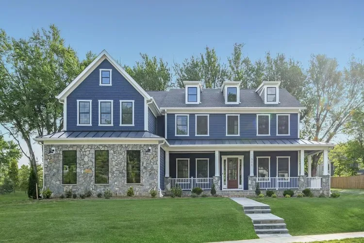
14. Navy Blue and White
 Source: Nick Glimenakis
Navy blue siding and crisp white trim make for a timeless, classic exterior look. There’s a reason this combo is so loved—it feels fresh and inviting.
White-framed windows and porch accents, like columns and railings, bring a sense of polish to the design. These thoughtful details matter.
For a cohesive feel, opt for simple landscaping like shrubs or flowerbeds—they’ll enhance the clean, coastal-inspired style effortlessly.
15. Blue, White, and Stone
 Source: Mary Pat Collins Photography
This trio of dark blue, white, and stone creates a house that feels clean and grounded. The blue siding offers depth, with white trim creating bright, crisp edges.
Natural stone accents around the base add contrast and texture, making the entire look feel more inviting and organic.
If you’re aiming for this design, use neutral landscaping and soft lighting—it’ll tie the overall style together without feeling overwhelming.
16. Black + Blue
 Source: Sara Liggoria-Tramp
Black trim paired with deep blue siding delivers a bold, modern vibe that’s still approachable. The mix is subtle but full of personality.
Adding planters or potted greenery by the entryway softens the design and brings balance to the darker tones.
This combo works best with simple, clean lines—keep everything minimal to let the colors speak for themselves without over-complicating the look.
17. Dark Blue + Brick
 Source: Lauren DeFilippo
Pairing dark blue siding with classic red brick creates a cozy yet sophisticated vibe for a home. The natural tones in the brick keep it grounded.
Using the brick on the lower half of the design adds texture while allowing the dark blue to remain the star of the exterior.
If you’re trying this at home, add copper or brass light fixtures—they’ll enhance the warm red tones in the brick and give the exterior a polished finish.
18. Black + White + Aqua
 Source: Kritsada Panichgul
A bold black exterior with crisp white trim feels modern and sleek. The simple color palette keeps the design timeless and versatile.
The aqua front door is the standout feature, injecting a bit of fun and personality into the otherwise monochromatic scheme.
To complement the look, try minimalist decor near the entrance, such as a neutral doormat or potted plants. These little touches can elevate the entire vibe.
The Pros and Cons of Dark Exterior Paint (Because Balance Is Important)
Before you call your painter, let’s weigh the good and the bad. (Yes, even moody, mysterious houses aren’t perfect.)
The Pros:
- Unique and Bold: Most houses in your neighborhood are probably beige (sigh). Dark paint helps you stand out effortlessly.
- Elegant & Modern: There’s a reason architects love dark exteriors—clean, dramatic, and timeless.
- Hides Dirt Well: Honestly, who enjoys scrubbing their house? Dark paint hides grime better than light colors.
The Cons:
- Can Fade Under the Sun: Dark colors absorb heat, which can cause fading over time. Invest in high-quality paint to avoid this.
- Might Feel Heavy on Smaller Properties: As I mentioned, dark colors can overwhelm small homes. Opt for contrast with trim or landscaping.
- Shows Damage More Clearly: Chips, cracks, or wear stand out more on dark paint. You’ll need to stay on top of maintenance.
No big deal, right? As long as you go in knowing these trade-offs, you’ll be fine.
Final Thoughts: Should You Go Dark?
Dark exterior house colors are more than just a trend—they’re a movement. Whether you’re aiming for modern drama, rustic charm, or downright bold vibes, dark paint can work wonders. Just keep a few things in mind:
- Choose a color that flatters your home’s style and surroundings.
- Don’t forget trim and contrast—it’s the difference between chic and meh.
- Be prepared for some upkeep. The boldness is worth it.
So, are you ready to take the plunge into the dark side? Let me know—FYI, I’ve been fully converted, and I think you’ll love it too. 🙂